Creatives
Occasions
Colour Worlds
Variant Trays
Type Study
Top row = the fix (text on a solid panel, legible every time). Bottom = earlier tries with text over the photo (hard to read). Click to zoom.
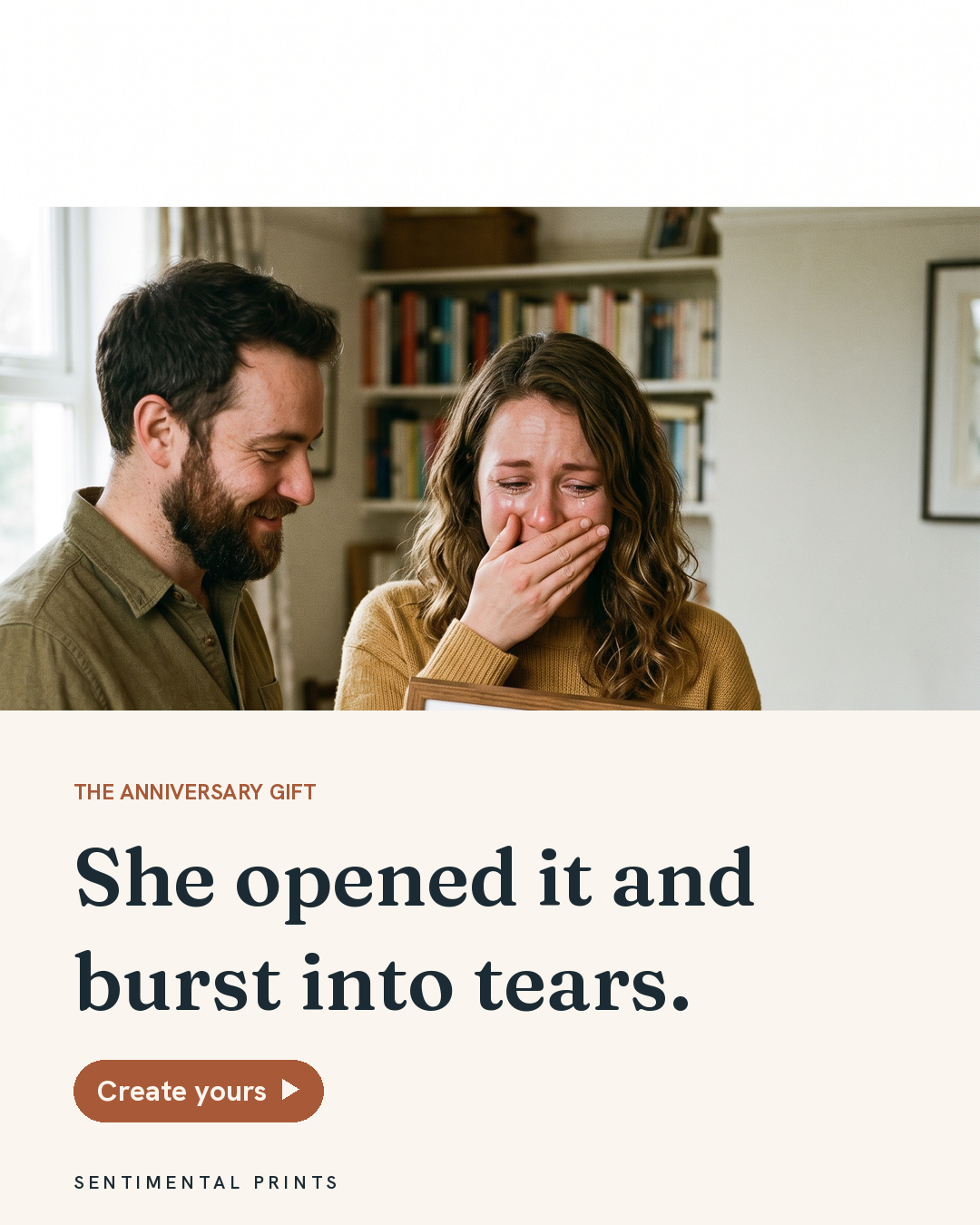
Photo on top, every word on a solid ivory panel. Text never touches the photo, so it reads on any shot.
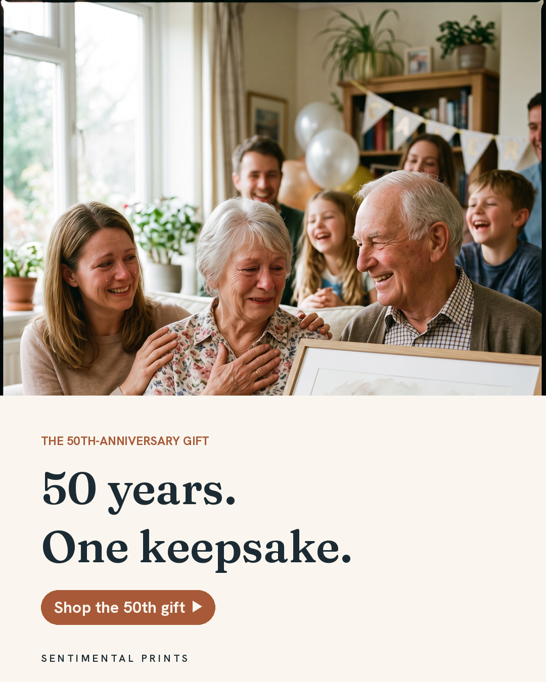
Proves it holds on a busy multi-person shot too.
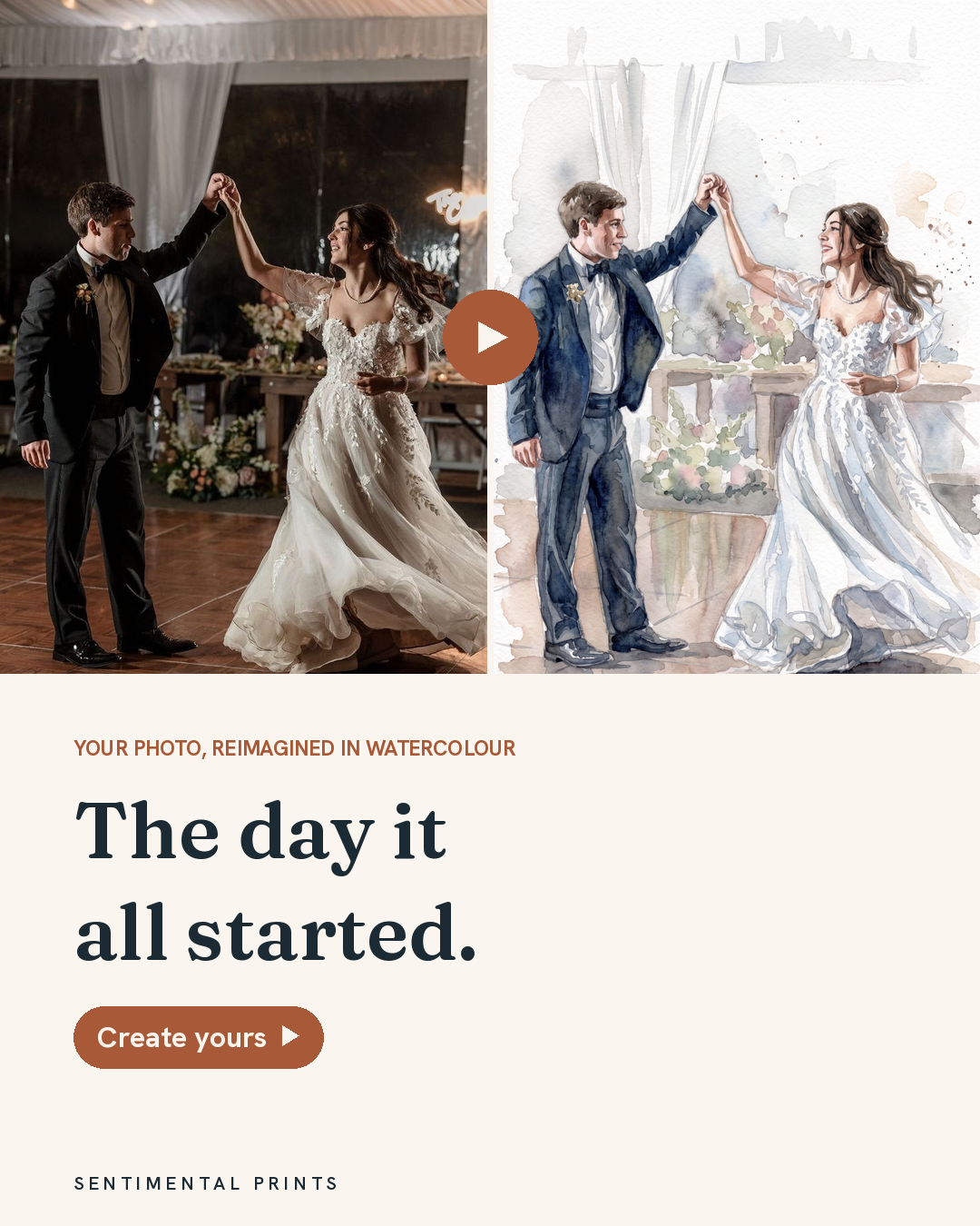
Real photo becomes the watercolour, arrow between, all text on the panel. Replaces the cluttered old before/after.
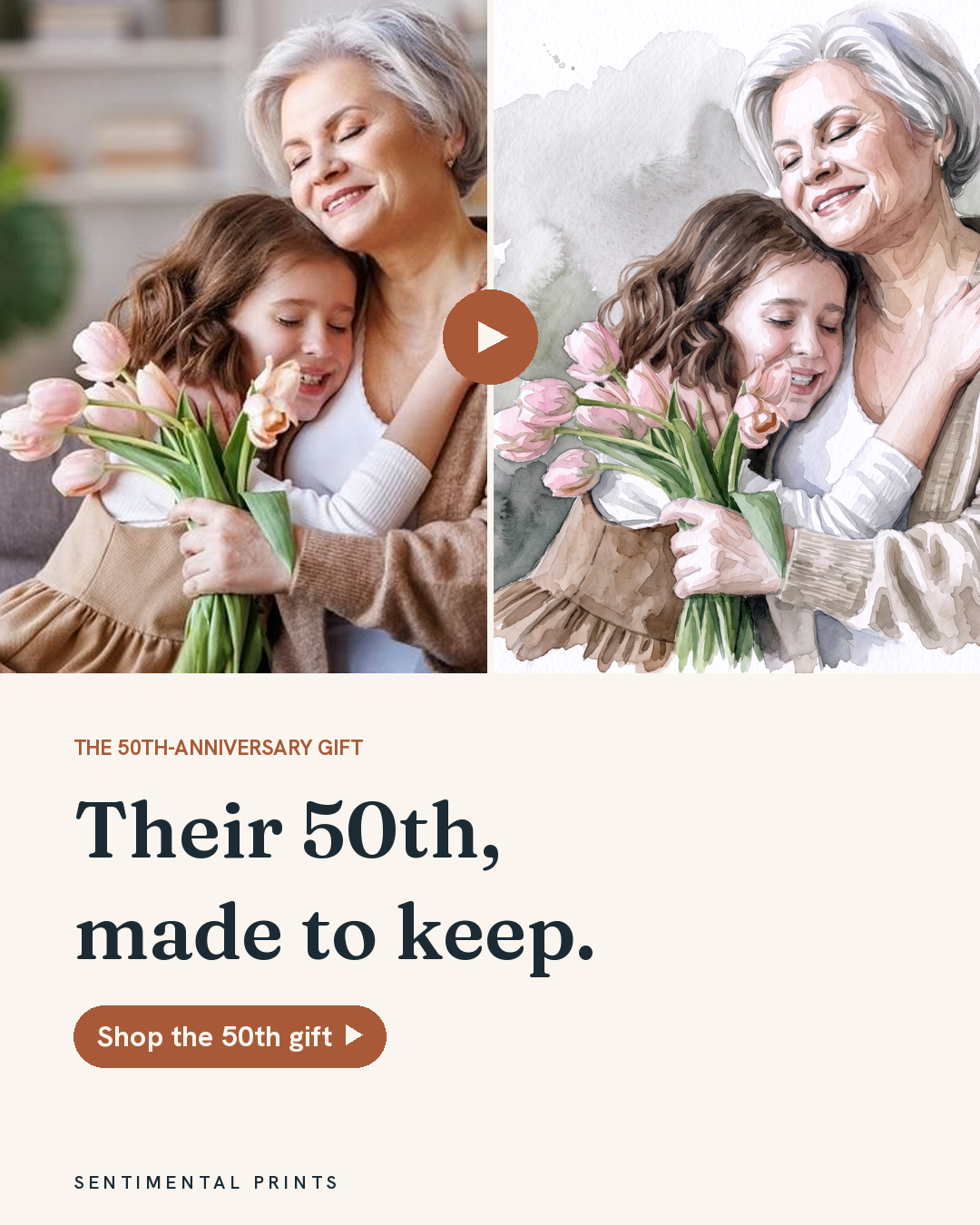
Transformation reads instantly, text fully legible.
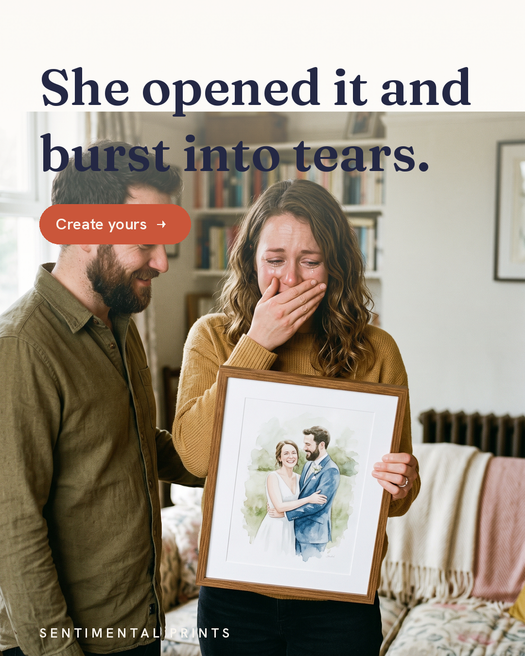
Headline floats over the photo with a scrim + cream gap. The "terrible" one.
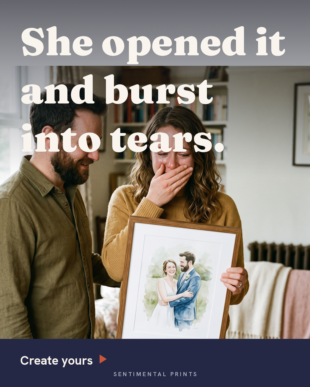
Full-bleed + heavy headline + solid navy CTA bar. Most PCP-like, keeps the whole photo.
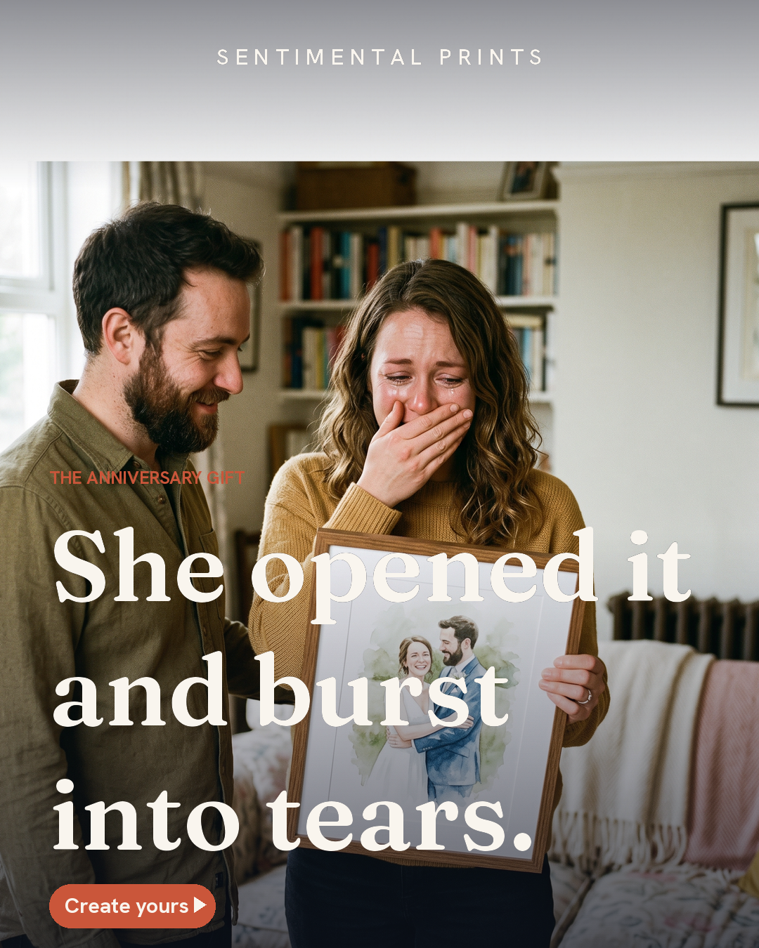
Masthead + editorial headline. Premium, but type still sits on the photo.
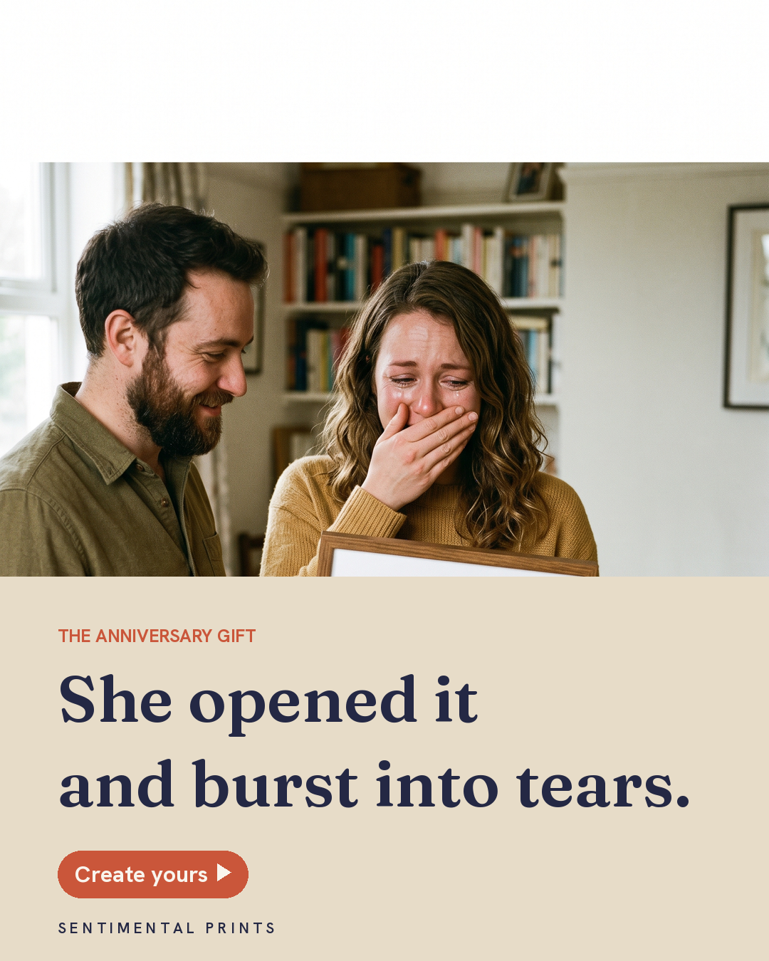
Type in its own sand panel, never over the photo. Cleanest, but crops the product.
Competitor Wall
153 rival ad creatives, all-time GB.
The Analysis
Winning angles + creative briefs.